


2015 Color Trends For Decor And Interiors
If you have a full scale home renovation on the cards for 2015 and are already shopping around for the elements to make your dream home a reality, get ahead of the crowd with the interior color trends for 2015 as predicted by Pantone in 9 different palettes, namely – Style-Setting, Abstractions, Botanicum, Zensations, Urban Jungle, Tinted Medley, Past Traces, Serendipity and Spontaneity.
Style-Setting
All about poise, finesse and polish, the ‘Style-Setting’ palette is a mix of blue, violet and brown shades with a taupe and an almond meal brown to lighten the palette. This palette is used in the elegantly appointed yet sumptuous bedroom.
Abstractions
In the Abstractions palette the aim is to bring together color similar to the conception of abstract art where the artists style may seem random but is in fact planned meticulously to create an image of varying shapes, many of them geometric. As the name suggests, this palette has a few bright colors that almost seem to clash, a deep red and a few overly bright blue hues with a lively green, a washed out hazel brown and blush apricot shade provide contrast.
Botanicum
A predominantly nature inrpired palette, “Botanicum” as the name suggests is a grouping of flora and fauna inspired shades creating a sophisticated yet soothing balance of colors. The brightly poignant antique moss offsets the by contrast subdued tones of the other colors in the palette.
Zensations
An effort to engage all of the senses and heighten visual pleasure through a set of intriguing colors that combines the blue and green families and intersperses them with a red based purple and metallic pale gold and silver grey.
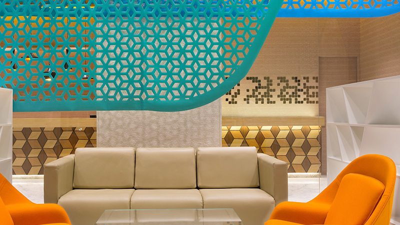
Urban Jungle
Bring the exotic hues of the jungle into your home with the “Urban Jungle” color palette. This palette combines warmer almost neutral and decidedly natural hues with the more exotically refined deep teal and a superbly punchy yellow that effectively wakes up the color grouping. If you are an urban sophisticate with a nature leaning soul, this palette will give you the colors to echo the jungle with an elegantly updated combination of shades.
Tinted Medley
Peach and pink dominate a color group that is watered down to a create a “Tinted Medley”. The tone of the palette is warm, where peaches and pinks are layered up with roses and yellows to create a combination of pale but not cold colors. Create a soothing effect in a nursery or little girls room with this palette as shown in the image below.
Past Traces
A modern take on something worn and the shabby chic trend, the “Past Traces” palette comforts the eye with a look that is does not scream brand new! The palette aims for a comfort factor from being in a room decorated to reflect personal history without the itchy new-ness of starkly flamboyant shades. Muted
pastel shades are offset by a vibrant new foliage green and a rosy hued dusty pink.
Serendipity
A moment of serendipity means a happy accident or a fortunate but unexpected occurrence! The “Serendipity” palette aims to achieve the same happy happenstance with the language of color. Unexpected colors and unlikely design renditions come together in a color palette with standout bright orange, a startling magenta pink and a scandalous scarlet, with a grey taupe as the only neutral relief.
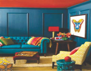
Spontaneity
And last but not least, the “Spontaniety” color palette is a study in upbeat, ‘not-meant-to-go-together’ colors that still somehow manage to work decor wonders as shown in the bedroom in the image below. The palette is fun and alive, a colorful encouragement to be yourself reflected in daringly individual color combinations.